MY ARTICLES ABOUT CULTURAL INTELLIGENCE
The future of design is rooted in cultural intelligence.
When we started thinking about the design of Imminent, the first idea that came to mind was this: let’s make maps of all the countries with the languages they speak. Great.
Our team collected data on languages, territories and populations; our designers started looking for a style to make the maps, and they decided on the colours.
The team was made up of two Italian designers, a Chinese colleague, an American born in Mexico, and me: I was born and raised in Italy, but my work has always been international.
We all agreed together on the colours and the style, based on our experience and our taste.
We designed hundreds of maps with thousands of languages. Divided up by continent and then by country.
A painstaking but wonderful job.
At a certain point, though, we started asking ourselves questions: are there five or six continents? We Europeans said five, since that’s what we learned at school. Our American colleague said six, as did our Chinese designer.
Okay, but if there are two Americas, where’s Central America? Can we tell a Mexican that we consider him a South American? Or a North American? Wait, don’t they want to put up a wall with Mexico in America? And what about Azerbaijan – is it in Asia or Europe? And Russia? Isn’t it half in Asia? And if there are two Americas, do we need to differentiate their colours? Could the colour we’ve chosen for Asia cause cultural problems?
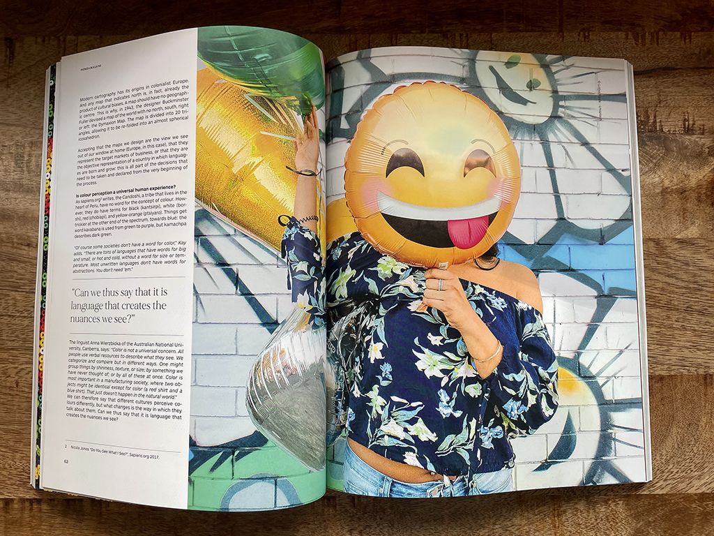
Isn’t green forbidden in Indonesia? And isn’t yellow the colour of pornography in China?
In short, having already completed the vast majority of our work, we found ourselves in complete chaos.
We started asking our network of linguists for feedback. Now the process was starting to make more sense, but instead of getting easier, our life got even more complicated.
Because in addition to cultural sensitivity, we found ourselves faced with new sensitivities relating to identity, politics and gender, where a colour, map or icon can signify something or its opposite, with the ability to offend, to have different meanings, or even to mean nothing.
While visual messages were once confined to the cities and places where they originated, in contemporary society they come together in a melting pot. On the one hand, this helps people to connect and understand one another. But, something that works and makes people laugh in one culture can offend people and generate conflict elsewhere. Potentially devastating conflict.
Working in Europe and only considering our own culture entails bias in the way we communicate and generate creativity.
We now find ourselves in a time of equal opportunities, including when it comes to the focus on sensitivity around ethnicity and gender.
Communicating visually is very complicated – at times almost impossible.
But as designers, it’s our calling to summarise things.
To tackle this complexity, we need a method.
We need a way to compare points of view that is both functional and culturally sensitive.
And it’s urgent, because if we look at the disruptive capability of the web to bring together half of the world’s population in a global conversation within its first thirty years of existence, what will happen in the coming years, when new metaworlds and migrations caused by our inhospitable planet will generate new languages, new revolutions and new technologies?
Read more on Imminent


